Flying Dress Color Guide: Which Color Works in Cappadocia?
Red, white, or blue? Which flying dress color produces the strongest photograph against Cappadocia's earth-toned backdrop? A complete guide by light, season, and location.
The visual power of a flying dress photograph doesn't come from movement and wind alone. Color is perhaps the single most critical decision shaping this image. Someone who deeply understands Cappadocia's distinctive color palette — orange tuff rock, earth-toned valleys, a sky that turns pink on certain mornings — chooses their dress starting from that palette. The wrong color can weaken even the best photographic technique. The right color transforms an ordinary frame into a timeless image.
In this guide we walk through each major color group and how it interacts with Cappadocia's different locations and light conditions. Our flying dress rental service carries a wide color range; this guide is designed to help you make the most informed choice.
For a complete overview, see our How to Plan Your Cappadocia Photoshoot: Complete Guide.
Cappadocia's Color Palette: Understand the Backdrop First
Cappadocia is a visually warm, earth-based palette. The dominant tones are orange, cinnamon red, cream, light brown, and pebble gray. On summer mornings, the sky is pure blue; at sunrise it offers a spectrum running from yellow through pink to purple. In winter months, this orange-brown ground enters sharp contrast with snow white.
This backdrop knowledge divides color selection into two fundamental strategies: contrast strategy (choosing a color that opposes the backdrop) and harmony strategy (choosing a tone that is close to but complementary with the backdrop). Both approaches have genuine strengths.
White and Cream: The Universal Choice
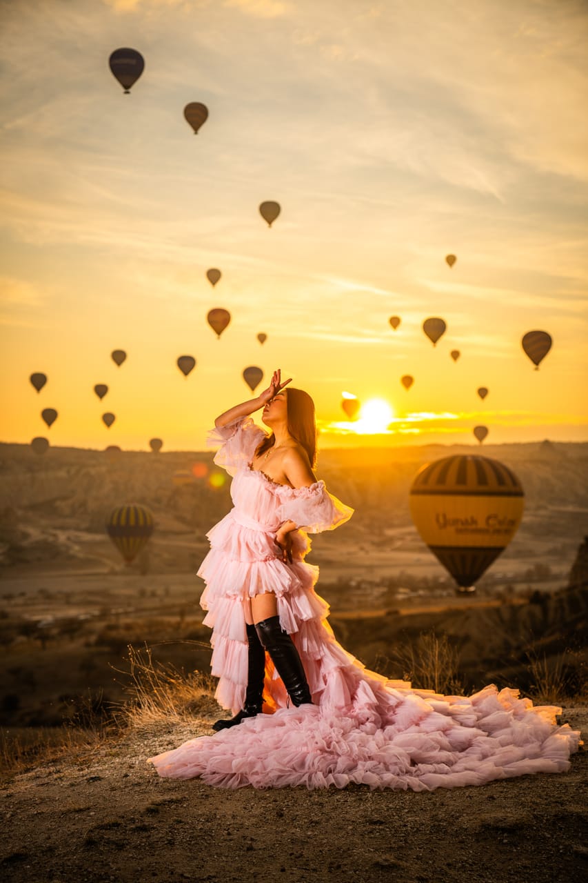
White is one of the most popular colors in flying dress photography — and that popularity is not accidental. White fabric in golden hour light takes on warm amber tones, standing clearly apart from the surrounding earth colors without clashing against them. This is one of the rare combinations that creates both contrast and harmony simultaneously.
When Does White Work Best?
- At sunrise during the blue hour transition: The warm-cool opposition between the cold sky tones and white fabric is mesmerizing.
- In front of fairy chimneys: The dialogue between the textured rock surface and the cleanness of white is compelling.
- With balloons in the background: The multi-colored balloons stand out beautifully against a white dress without competing with any single tone.
The one challenge with white is that it is a flat color fully dependent on the quality and flow of the fabric. A gently billowing, breathable fabric looks extraordinary in white; a stiff or heavy one remains ordinary in the same color.
Cream tones are a warmer, more organic version of white. They produce slightly less sharp contrast in photographs but a more integrated feel; they harmonize especially well with autumn light.
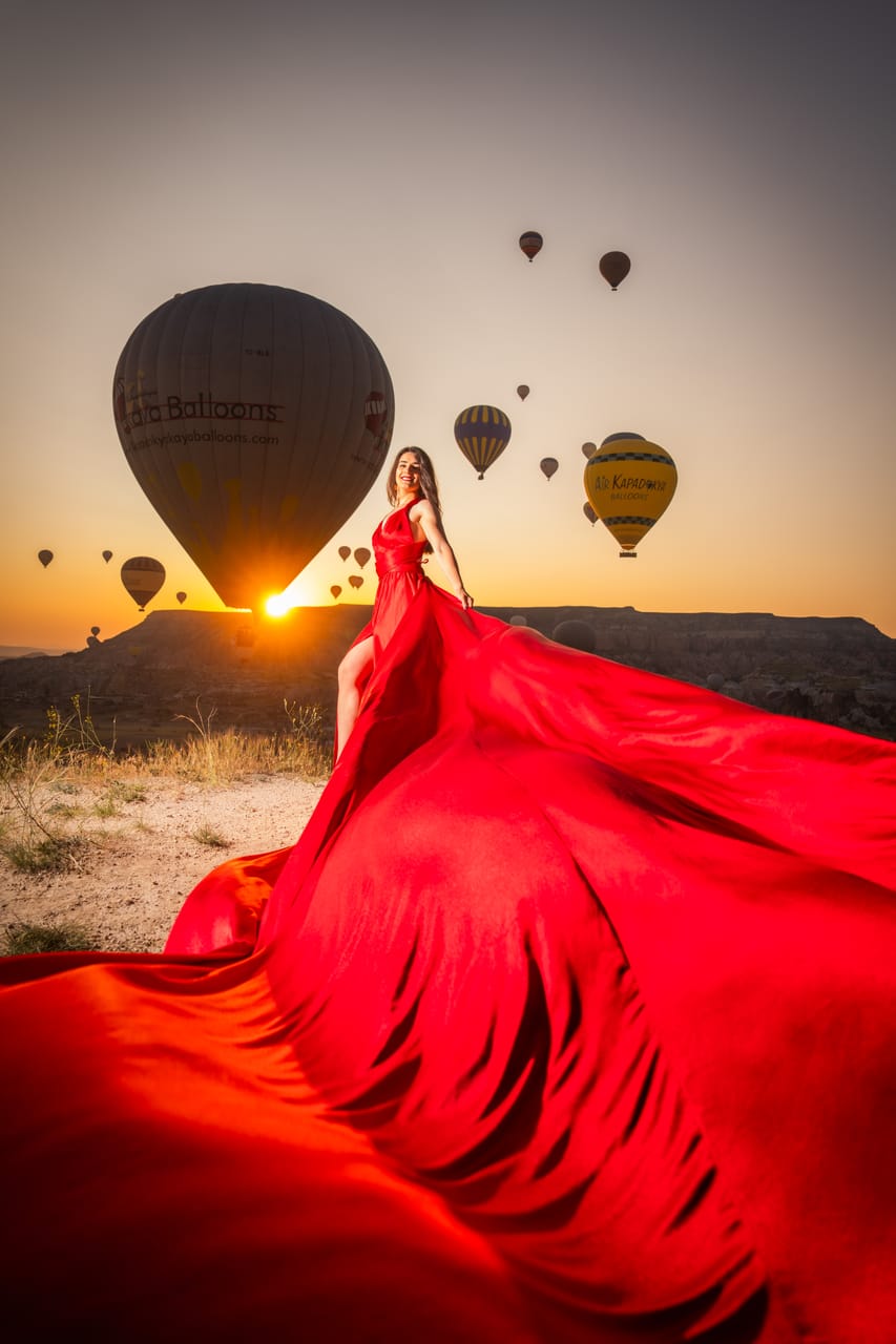
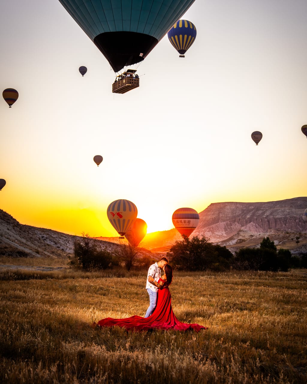
Red and Burgundy: Drama and Power
A red flying dress is among the most attention-capturing combinations on social media — with good reason. When red fabric opens in the wind against Cappadocia's orange-yellow ground, it appears to ignite. This adds a kind of energy and power to the photograph that other colors cannot match.
When Does Red Shine?
- Balloon sky backdrop: The contrast between blue sky and red dress is near-perfect. The multi-colored balloons don't absorb red — they complement it.
- Uchisar panorama: Against the horizon line, red fabric spreading across a wide ground multiplies the cinematic effect.
- Winter snow contrast: With snow on the ground, the red-white contrast is graphic and powerful — a visual rarely achievable anywhere else on earth.
When Is Red Risky?
In Red Valley (Kızılçukur) or the most orange sections of Pigeon Valley, a red dress can blend into the background, causing the subject to disappear into the scene. If you want to use red in these locations, it is critical that the photographer positions you against sky rather than rock.
Burgundy is a more controlled and refined version of red. It draws less attention than red in golden hour light, but offers a more elegant and timeless feel — especially powerful in autumn shoots.
Blue and Teal: The Earth Tone Complement
In color theory, orange and blue are complementary colors — meaning a blue dress against Cappadocia's backdrop creates a relationship of opposition that simultaneously makes each more visible. This combination is not as dramatic as some others, but it produces a sophisticated and visually balanced result.
Why Does Blue Work in Cappadocia?
The complementary color relationship between the reddish-orange tuff rock and blue fabric adds a natural tension to the photograph. This tension is not aggressive — it is refined and engaging. Especially during open hours at Göreme valley, the contrast between fabric and ground tone is sharp and clear.
Deep navy near the end of the blue hour light appears almost black — extraordinarily elegant. Light teal in the pastel light of sunrise gives a sense of weightlessness and airiness.
Yellow and Orange: Careful Placement Required
Yellow and orange tones are the riskiest choices against Cappadocia's warm backdrop — when they don't work, the dress and the ground merge into each other. But in the right conditions, they produce an exceptionally lively and joyful visual.
Right Conditions for Yellow
- Winter mornings: Against a gray or white sky, yellow is extremely powerful.
- Blue hour: Against a not-yet-fully-lit sky, yellow stands out like a bright accent point.
- Shaded paths: If the rocks are in shadow while the yellow dress is catching light, an interesting dynamic contrast emerges.
Bright orange carries blending risk against almost every Cappadocia backdrop and is generally not recommended for dress shooting. If the tone approaches golden yellow, the situation improves somewhat.
Black: Power and Minimalism
Black is perhaps the least used and most misunderstood color among flying dress options. Black fabric in golden hour light catches dramatic edge lighting that reveals the fabric's folds and movement in three dimensions. The brighter and warmer the backdrop, the more powerful black appears against it.
When Does Black Stand Out?
- Uchisar panorama: Against an open blue sky and balloon colors, black creates a striking silhouette effect.
- When light filters horizontally: Edge lighting dimensionalizes black fabric and makes texture visible.
- Minimalist and artistic interpretations: Ideal for those targeting fewer photographs, each of exceptional power.
The only disadvantage of a black dress is that it absorbs more warmth in cold morning hours — though this can actually become an advantage.
Seasonal Color Recommendations: Quick Reference
- Spring (April-May): White, cream, light teal, light blue — pastels and neutrals that complement soft light
- Summer (June-August): Red, burgundy, navy — strong colors for strong light
- Autumn (September-October): Burgundy, earthy red, dark teal, cream — complements the rich autumn light
- Winter (November-February): Red, black, vivid yellow — maximum contrast against snow
Frequently Asked Questions
Can we use two different dresses in one session?
Yes, some of our packages allow for two dress changes. This affects the session planning and may require additional time; mention it when booking.
Should I ask the photographer about color?
Absolutely recommended. Our photographer, knowing the location and light conditions planned for your shoot day, can offer the most precise color advice for your specific session. This conversation is easy to have over WhatsApp before your shoot.
Do bright colors work at sunrise too?
Yes, but with a different character. In the pastel light of sunrise, bright colors soften slightly — sometimes this is an advantage (a gentler visual), sometimes it reduces the intended impact. For powerful colors like red, light after full sunrise occasionally yields sharper results.
Does fabric type affect color choice?
Directly. Glossy surfaces like silk or satin reflect light — this creates dramatic edge effects especially in darker colors. A matte texture gives a softer, more organic feel and works beautifully with lighter colors. Every dress in our rental collection has been selected with exactly these conditions in mind.
Keep this in mind as you choose: there is no single correct color — every color has conditions where it works powerfully. The goal is to find those conditions. Let's find them together.
Share your dates and preferences; we'll plan the color, location, and light together. Start planning or message us on WhatsApp.
Your story begins in Cappadocia
We'll craft something timeless — quiet, elegant, and cinematic.
Explore Experiences